Merchant PortalBilt Rewards

  • Head of Design…… Robert Myrsäter
  • Role…… Sr. Product Designer
  • Typefaces…… GT America
  • Amenity & Booking Management
  • AI Audience Builder
  • Concierge Chat Handoff

Amenity & Booking Management

Overview

Bilt property managers needed a way to configure bookable amenities and attach offers and events to them. The straightforward version of this is a booking form. What we built is more considered: a layered management system designed from the start to generalize beyond amenities.
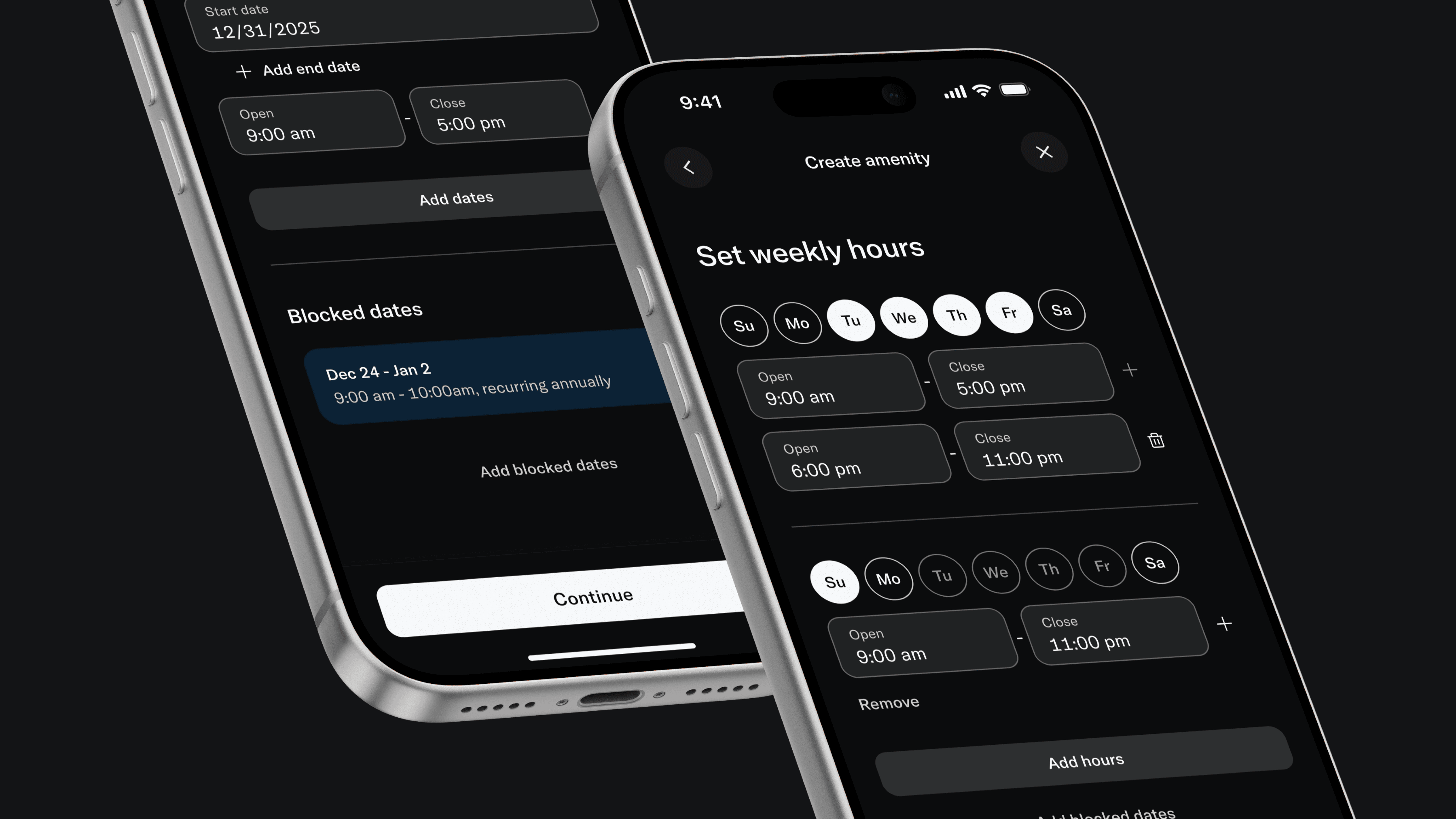
Two iPhones on black: Create amenity flow with weekly hours, day selectors, time slots, and blocked dates

Three Nested Layers

A base amenity—details, access rules, weekly hours, blocked dates. A sub-event on top—specific dates, independent capacity and pricing, booking visibility controls. A booking offer also on top—Platinum members get waived fees, for example—with its own schedule and inventory model.

Each layer is self-contained. The design challenge was making that feel intuitive rather than architectural.
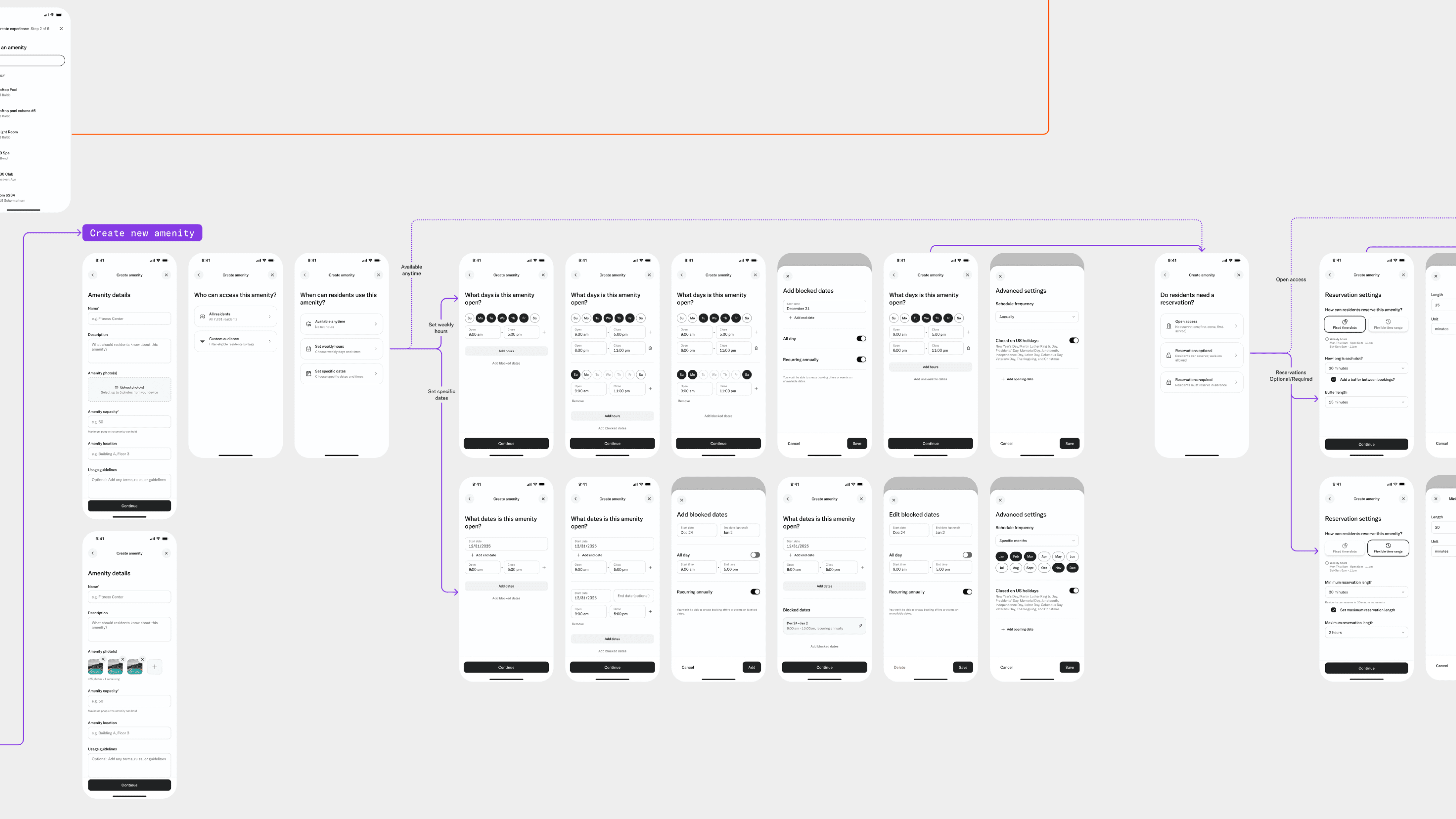
Create new amenity flow map: mobile wireframes for amenity details, access, scheduling, reservations, and advanced settings

Availability Was the Hard Part

Scheduling had real edge cases. A manager selecting Monday and Friday with different hours needed the system to split those automatically—two schedule cards, independently configurable. Blocked dates added annual recurrence, all-day toggles, and edit controls on top of that. Progressive disclosure handled the complexity: show the common case, reveal the rest only when needed.
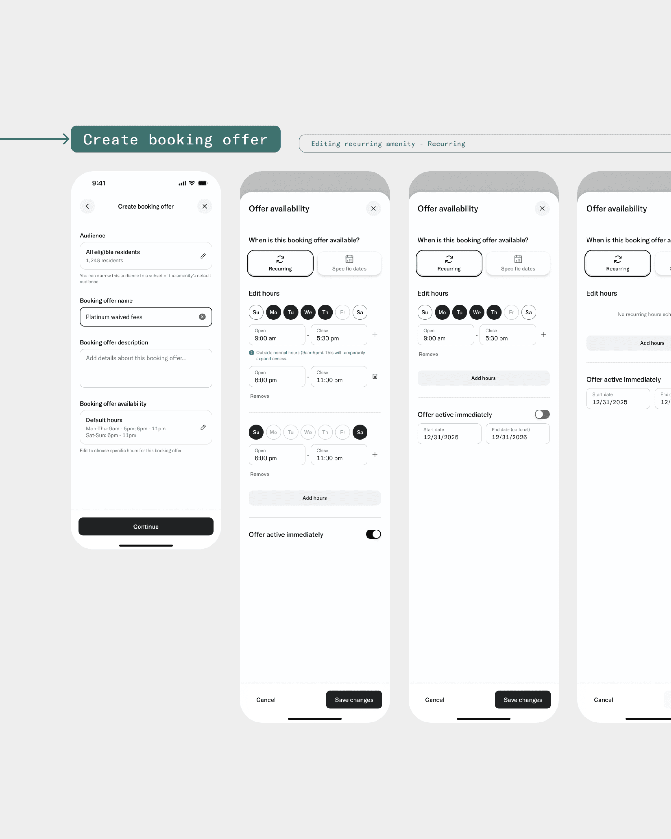
Four iPhones: Create booking offer screens with audience, Platinum waived fees, and recurring offer availability
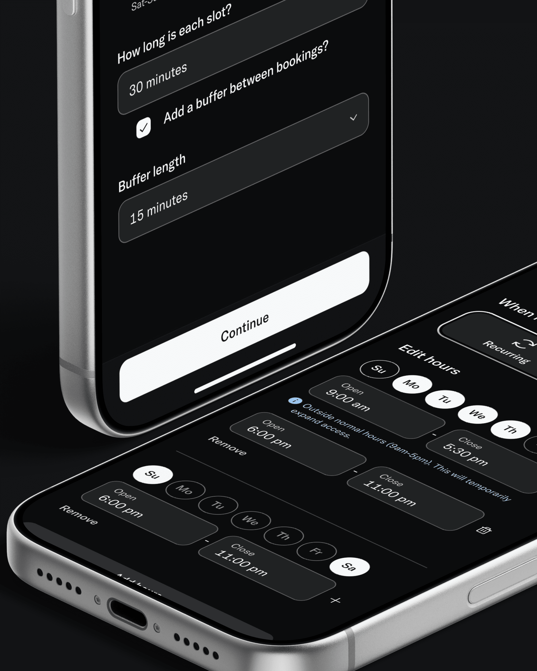
Two iPhones on black: slot duration, buffer between bookings, and Edit hours with weekend time ranges
Four iPhones: Create booking offer screens with audience, Platinum waived fees, and recurring offer availability
Two iPhones on black: slot duration, buffer between bookings, and Edit hours with weekend time ranges

Reservation Settings and Booking Offers

Reservation settings branch early: open access, optional, or required. Fixed time slots and flexible time ranges handle the two main ways properties run bookable spaces, with buffer controls, capacity limits, and approval requirements underneath.

Booking offers were the most technically nuanced piece. The shared vs. reserved inventory split—draw from the amenity's pool or carve out a dedicated slice—required a clear explanation at the point of decision without turning the screen into a help article.
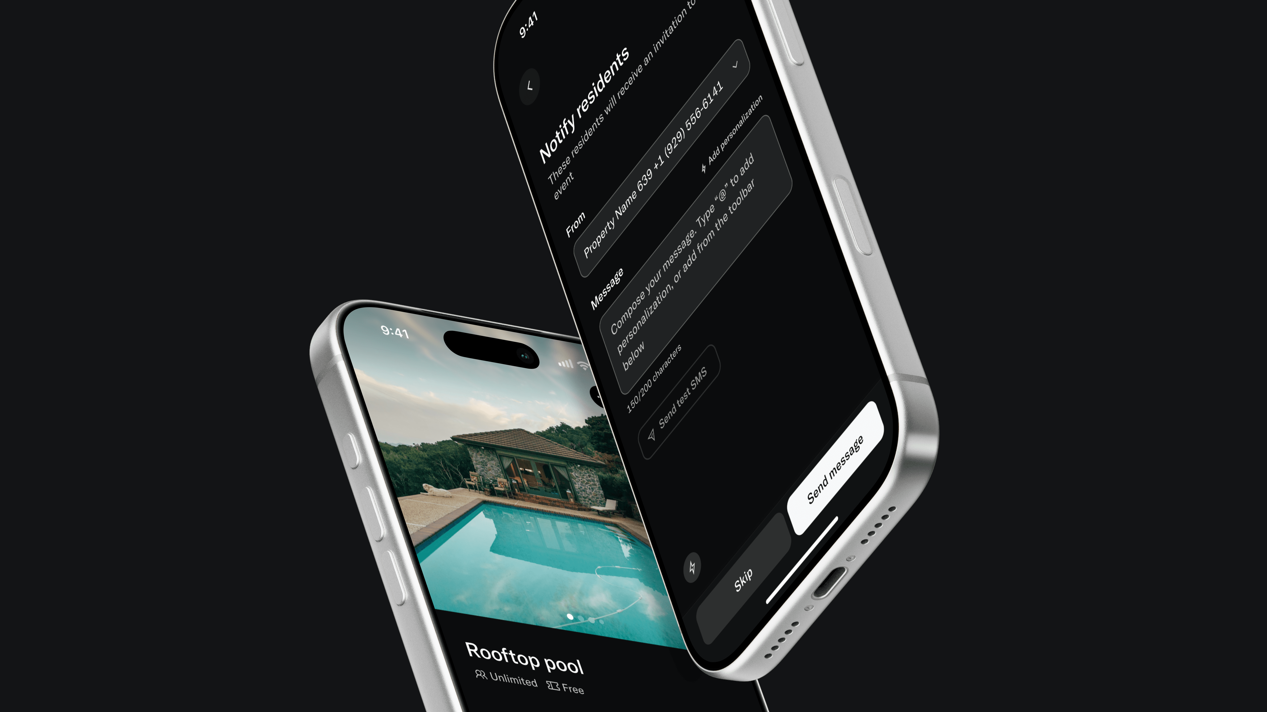
Two iPhones on black: Rooftop pool amenity detail and Notify residents SMS composition screen

Reflection

Abstracting the data model early made the design harder in the short term and more durable in the long term. Every pattern here is reusable across product types. That was the point.

What I'd push further: a summary surface on the base amenity showing which offers and sub-events are currently active. Right now that requires drilling in. It's a small gap in an otherwise connected system.
AI Audience Builder

Overview

Bilt's restaurant partners needed a way to target the right guests with the right offers. The existing approach made operators think in filters and data rules, but operators think in plain language. "My best regulars." "Wine lovers who spend a lot." This project was about closing that gap.

The Problem

Our backend had just unified guest identity across visits, orders, and reservations into a single model. Powerful, but it made the underlying complexity worse for anyone configuring targeting manually. The question became: what if the interface disappeared entirely, and operators just described who they wanted?

I explored four directions before committing: a structured Builder, a system-led Guided flow, a recognition-first Interpreter, and an AI-first Concierge. Rather than pick one and defend it, I prototyped all four to find out what broke first. The Concierge model won, not just because natural language was easier, but because hiding the data model entirely and exposing the AI's reasoning through editable output solved a problem the others couldn't.

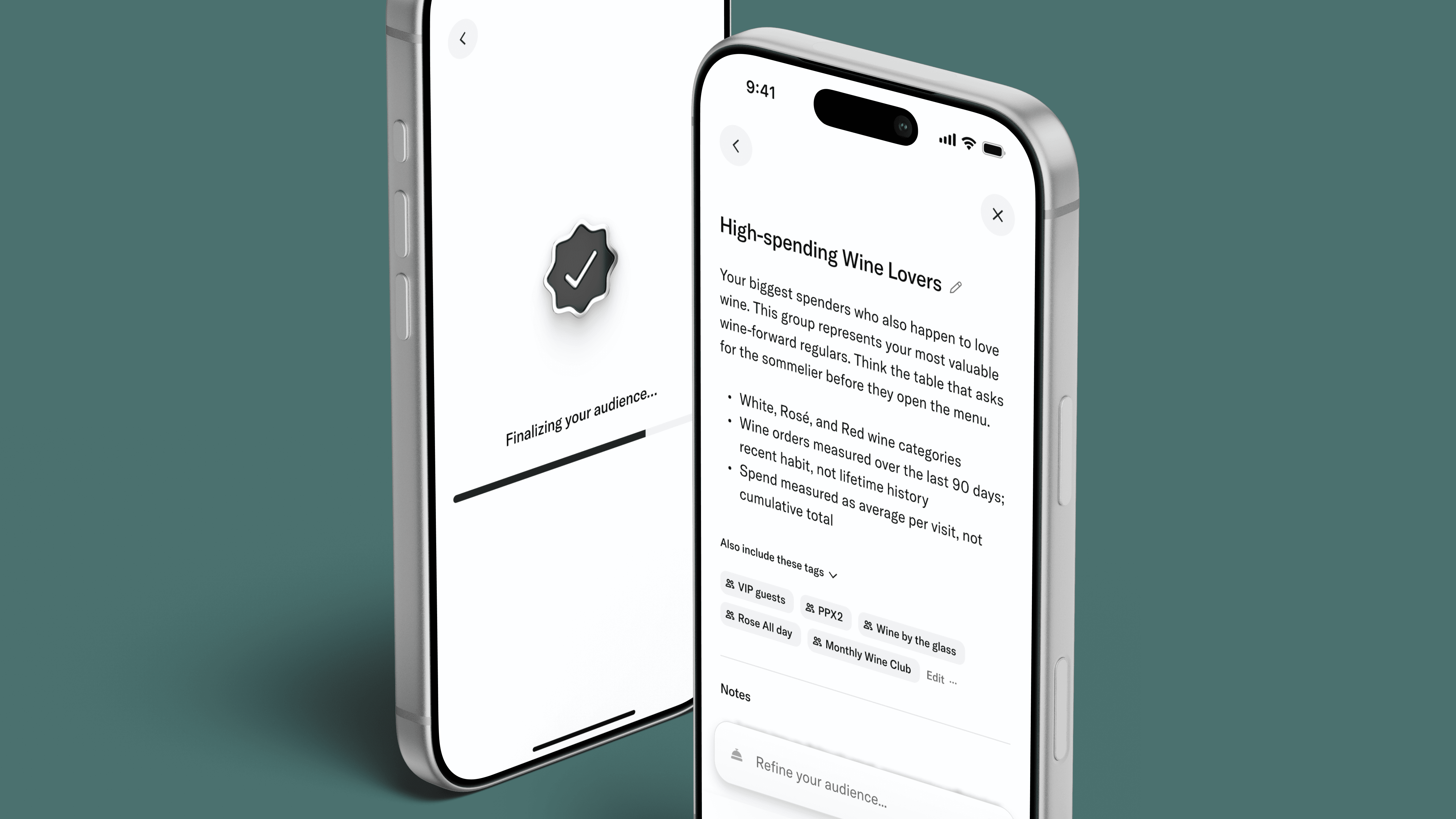
Two iPhones on teal: Finalizing your audience loading state and High-spending Wine Lovers result with tags and refine field

How It Works

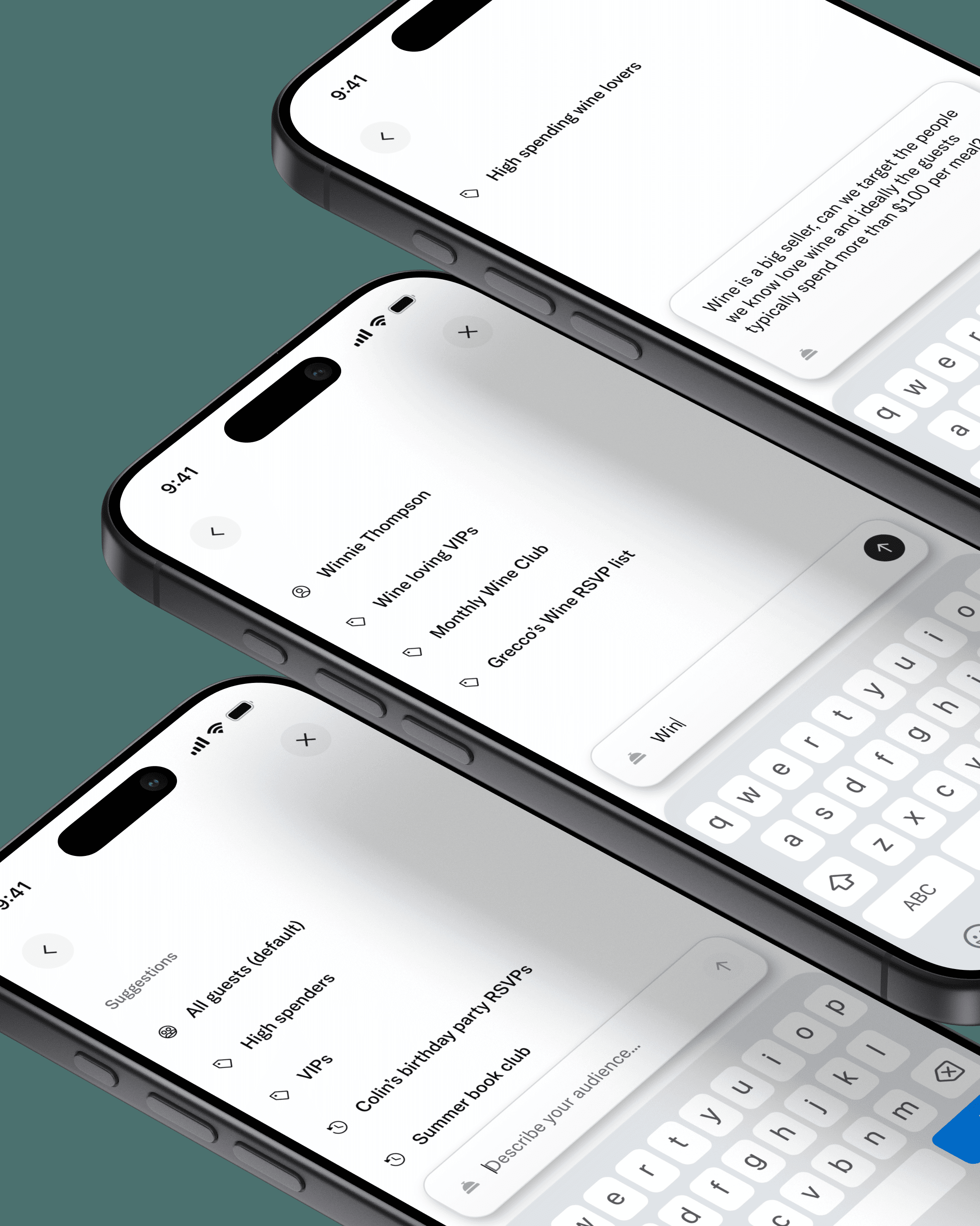
The entry point is a plain-language field. As the operator types, the system surfaces suggestions from their existing audience library and AI-generated options. Clear inputs resolve directly. Ambiguous ones, like typing a guest's name when the system isn't sure if you mean a person or a persona, trigger a single clarifying question before proceeding.

The loading sequence was a specific product ask. The AI processing time was real, and we needed it to feel intentional. Three sequential states with distinct copy turned a potential liability into a trust-building moment.

The Result and Editing Model

Once the AI resolves the audience, it shows its work: a name, a plain-language description, and the tags it applied. If something's off, the operator refines in the same input field and the result updates in place. Duplicate name validation surfaces inline rather than as a generic error.

The save step handles a three-way merchant scoping model without feeling like a permissions form. "Make it a tag," which surfaces the audience on guest profiles, lives secondary to the save action and defaults off.

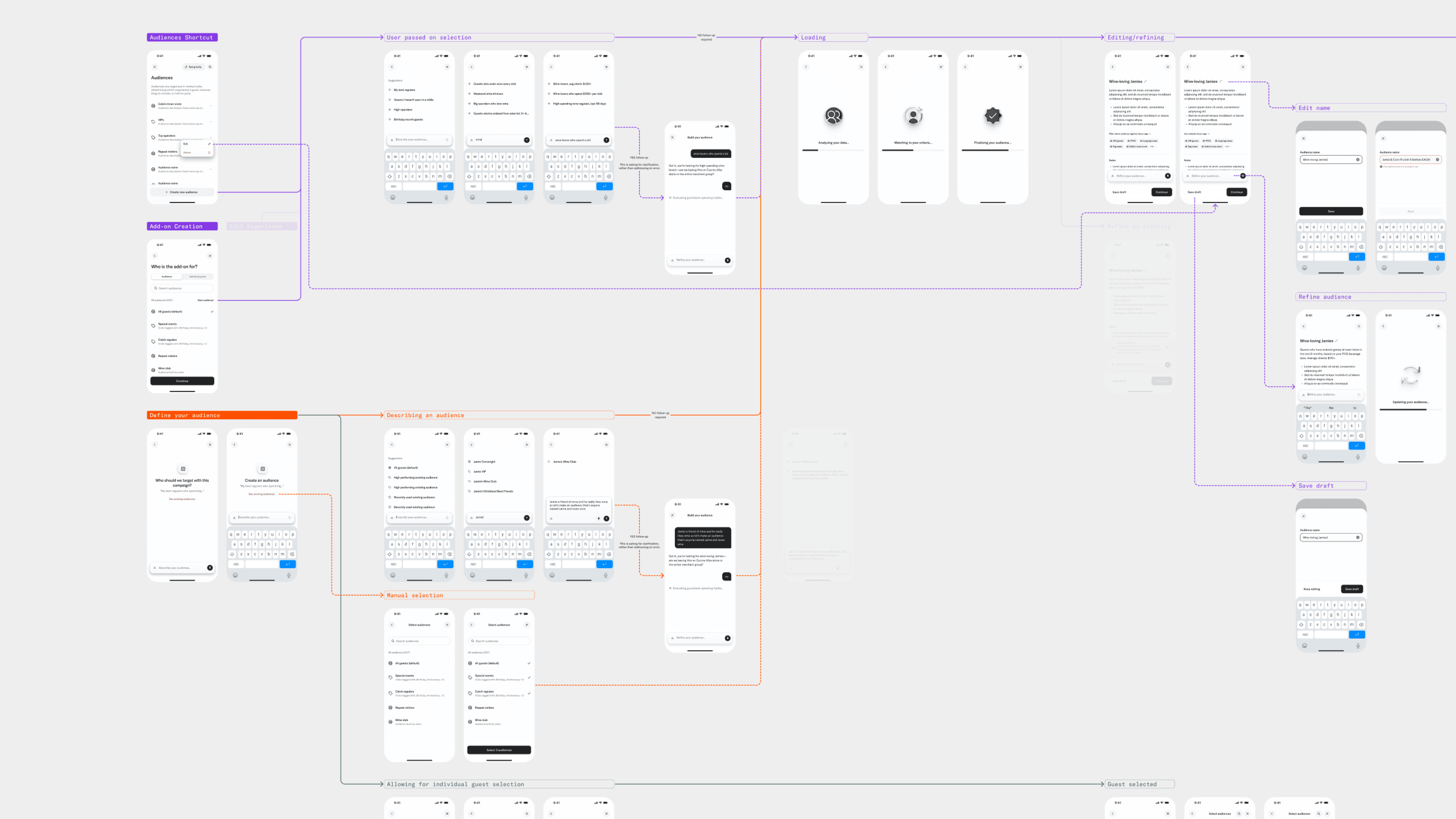
AI Audience Builder flow map: mobile screens for plain-language input, loading states, audience review, refine, and save

Managing What You've Built

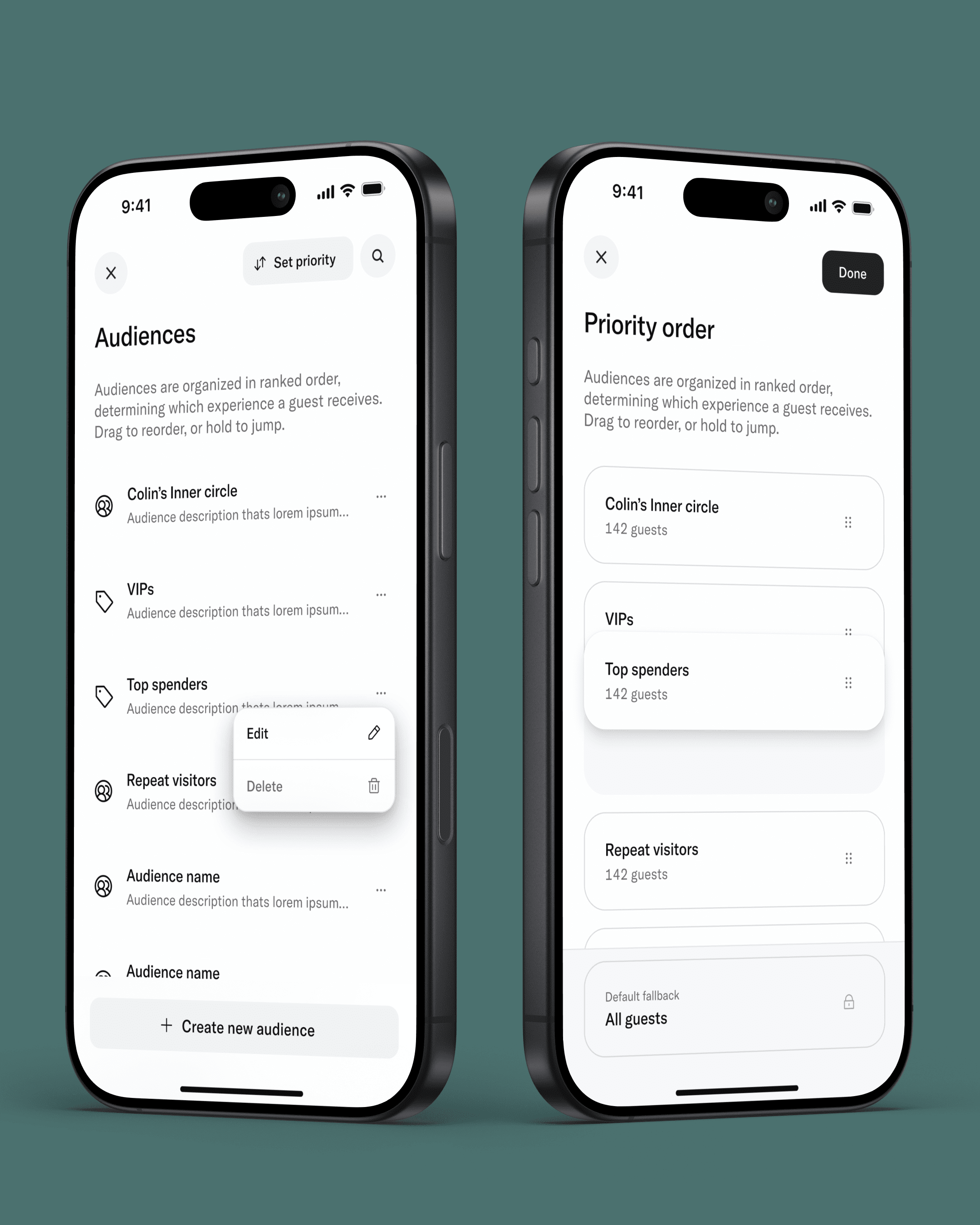
Audience creation was only part of the problem. Operators also needed to manage a growing library of saved audiences and control which ones took priority when a guest qualified for multiple. We built a dedicated priority mode with drag handles, long-press context menus for quick edits, and a double-confirmation delete with a type-to-confirm step for anything destructive. The goal was a management layer that felt as considered as the creation flow.

Three iPhones on teal: Describe your audience field with suggestions, typed search, and generated audience card
Two iPhones on teal: Audiences list with edit menu and Priority order drag-to-reorder mode
Three iPhones on teal: Describe your audience field with suggestions, typed search, and generated audience card
Two iPhones on teal: Audiences list with edit menu and Priority order drag-to-reorder mode

Reflection

The hardest problem wasn't the input or the output; it was the middle. Designing for AI confidence levels, deciding when to ask a follow-up versus when to just commit, required inventing rules that only real usage will validate.

The flow map was the most valuable artifact I made. Before any screen got designed, the paths were drawn, and that map became the shared language between design, product, and engineering for everything the system needed to handle.

Concierge Chat Handoff

Overview

Bilt's AI Concierge handles guest conversations automatically. But sometimes a guest needs a human — and engineering's solution was to spawn a second dedicated phone number rather than hand off the original thread. Number A stays with the Concierge. Number B is staff-only. Both run simultaneously.

The right product call. A genuinely novel UI problem.

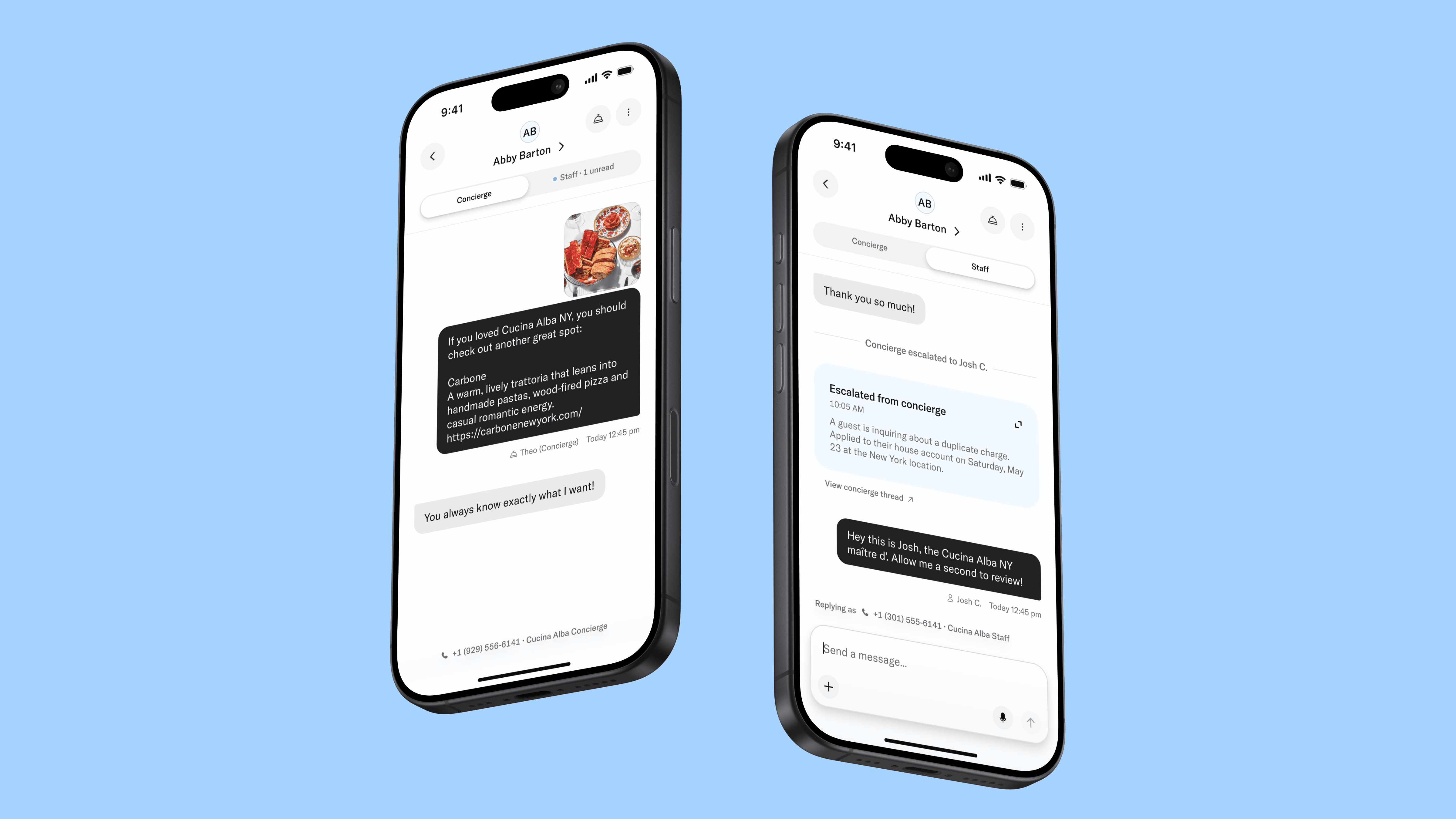
Two iPhones on blue: Concierge thread with Carbone recommendation and Staff thread with escalation summary card from Josh C.

The Problem

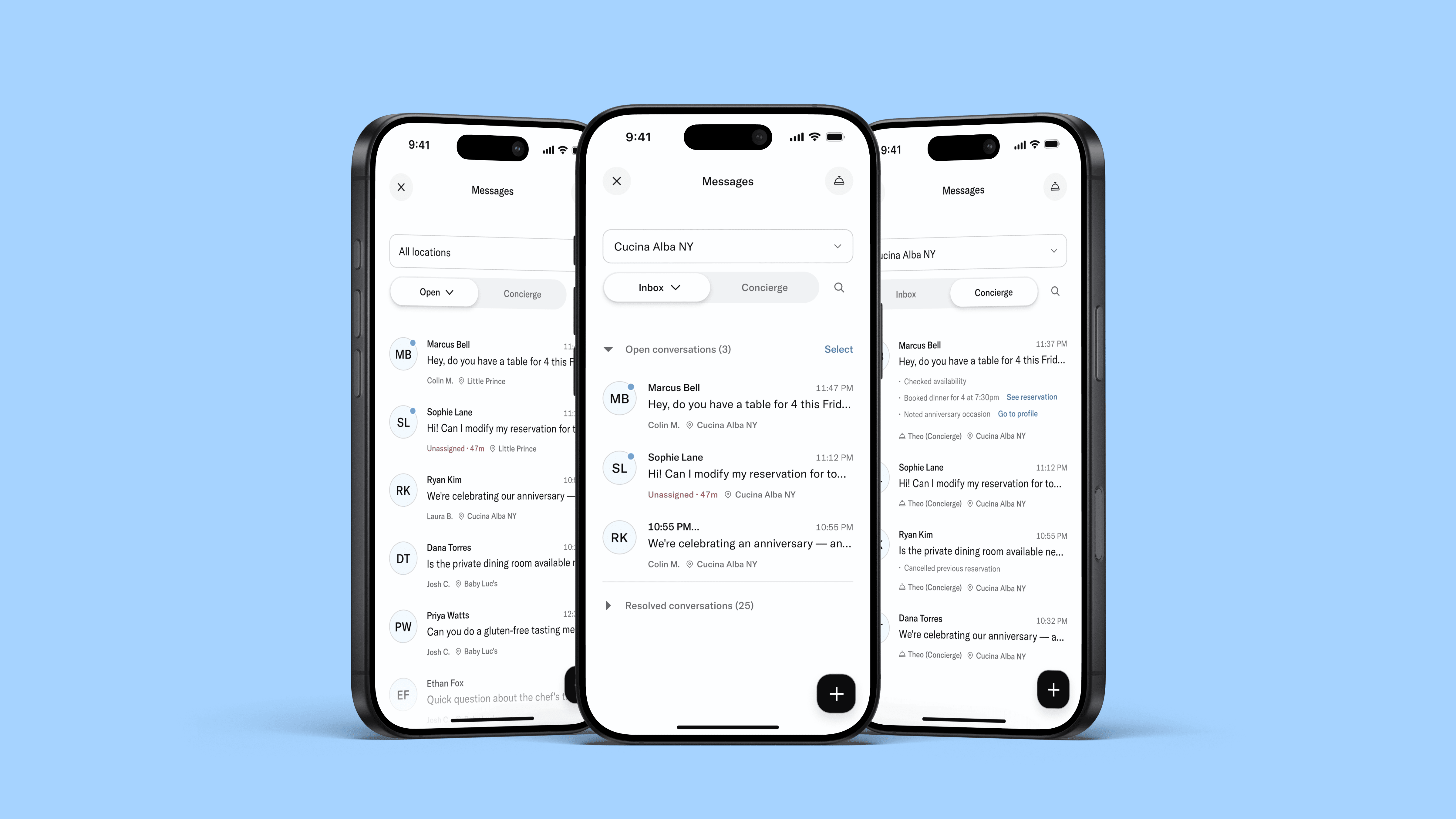
Staff now had two parallel conversations with the same guest and nothing in our existing messaging patterns accounted for that. Four surfaces needed rethinking: the in-thread view for both sides, the inbox list, the Concierge tab, and the reassignment flow.

Solving the Thread View

On the Concierge side, a system message marks the escalation moment and a persistent "Active staff conversation" indicator keeps the link to B visible — while the Concierge keeps responding normally above it. On the staff side, the thread opens with a summary card: what the issue is, what the Concierge already handled, and a link back to A.

A tab rail (Concierge / Staff) handles navigation between threads without going back to the inbox.

One stakeholder request I pushed back on: a toggle inside the thread to flip between conversations. I argued it was a notification problem, not a navigation problem — a subtle unread dot on the back button communicates awareness without implying the two threads are equivalent peer channels. That's what shipped.

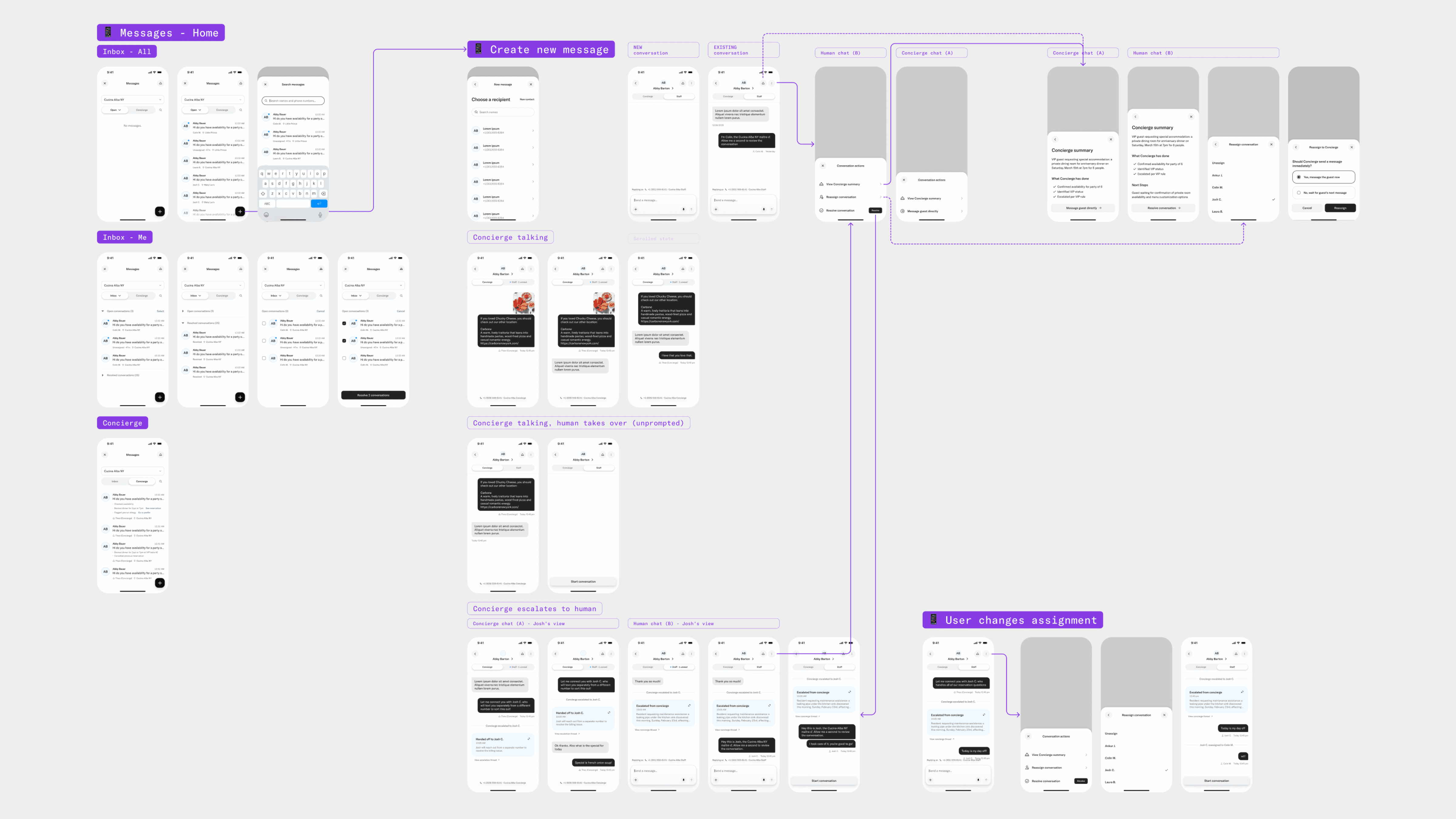
Concierge chat handoff flow map: wireframes for inbox, Concierge and Staff threads, escalation, handoff summaries, and reassignment across mobile screens

Inbox and Reassignment

Tab separation keeps high-volume property managers oriented without cluttering individual thread rows. Escalation badges surface state at a glance.

Reassignment was simpler than expected: human-to-human handoffs don't need ceremony, but the incoming staff member still needed the Concierge summary context, not just an open thread.

Three iPhones on blue: Messages inbox with Open and Concierge tabs, location filters, and Concierge-handled reservation actions

Reflection

The hardest part wasn't any single screen — it was maintaining a coherent mental model across five surfaces simultaneously. The flow map was the most valuable artifact I made: less a deliverable, more a shared contract between design, product, and engineering.

The one thing I'd revisit: the consumer side. Most of this work is designed from the staff perspective. How a guest perceives their conversation branching into a parallel thread is still worth examining.

Information
Selected Work